Accent walls are a game-changer. If you’re looking to refresh your space without the commitment of repainting the whole room, adding an accent wall is the perfect solution. But the color you choose does more than just add style—it can actually affect how you feel in the space.
That’s where color psychology comes in. Every color has an emotional tone. Some create a calming atmosphere, others spark creativity, and some give you that cozy, welcoming vibe.
In this post, we’re breaking down the best accent wall colors according to color psychology so you can choose a shade that enhances your mood and matches your home’s purpose.
What Is Color Psychology and Why Does It Matter?
Color psychology is the study of how colors influence our emotions and behavior. It’s used in marketing, branding, and yes—interior design. The idea is simple: different colors trigger different emotional responses.
For example:
- Red often increases energy and excitement.
- Blue can lower your heart rate and promote calm.
- Yellow is linked to optimism and creativity.
In your home, that means choosing color isn’t just a style decision—it’s a mood-setting one. A smart accent wall doesn’t just look good; it makes you feel good too.
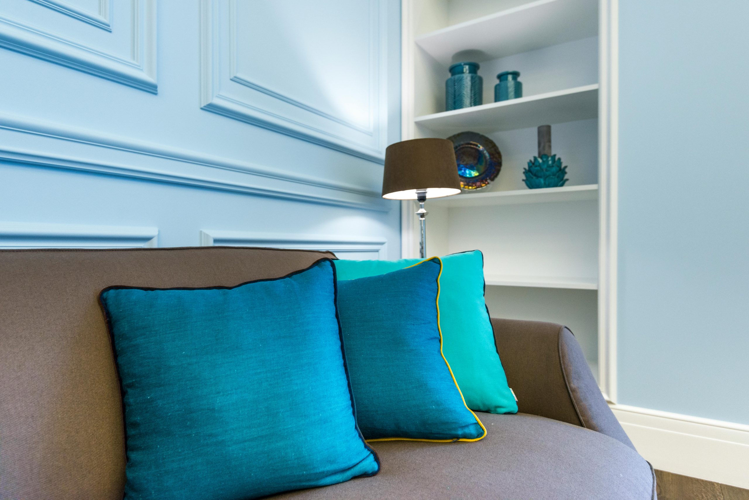
1. Blue: The Ultimate Calm-Down Color
Best rooms: Bedrooms, home offices, bathrooms
Blue is one of the most popular accent wall colors for a reason—it instantly creates a sense of calm and order. If you’re someone who wants a space to unwind, clear your mind, or focus without distractions, blue is your go-to color.
Why it works:
Blue is known to lower blood pressure, reduce stress, and promote a feeling of serenity. It’s associated with stability and reliability, which makes it perfect for areas where you want peace and focus.
Blue tones to consider:
- Soft Sky Blue: Perfect for bedrooms or nurseries. Light and airy, it helps create a tranquil retreat.
- Navy Blue: Adds drama without chaos. It’s bold yet grounding, making it ideal for an office or formal dining space.
- Slate Blue: A slightly muted option that works beautifully with modern decor, metals, and natural wood.
Design tip:
Balance blue with warm-toned furniture or textiles to keep the room from feeling too cool or sterile.
2. Green: For Balance, Freshness, and Renewal
Best rooms: Living rooms, reading nooks, home gyms
Green is the color of growth and nature. It creates a sense of balance and renewal, which makes it one of the most versatile and relaxing colors for an accent wall.
Why it works:
Green is easy on the eyes—literally. It’s said to reduce eye strain and bring the outdoors in, which can help you feel more grounded and refreshed. If you’re someone who wants a restorative vibe in your home, green is a solid choice.
Green shades to try:
- Sage Green: Soft and neutral, it brings calm and a trendy, modern feel. Great for minimalist or Scandinavian-inspired homes.
- Olive Green: Has a slightly retro, earthy vibe that pairs well with vintage and boho decor.
- Emerald Green: Rich and dramatic, this jewel tone feels luxurious while still being comforting.
Design tip:
Green pairs beautifully with natural elements like wood, stone, rattan, or linen. Try adding leafy plants or botanical prints for a cohesive, nature-inspired space.
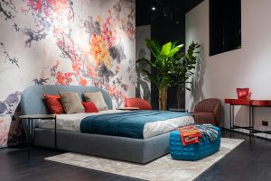
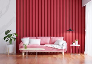
3. Red: High-Energy and Bold
Best rooms: Dining rooms, kitchens, home gyms, creative studios
Red is one of the most stimulating colors you can put on your wall. It’s tied to passion, energy, and even appetite—making it a great option if you want to spark conversation, creativity, or excitement.
Why it works:
In color psychology, red is a stimulant. It can increase your energy levels, raise adrenaline, and even make your heart beat faster. That’s why it’s often used in restaurants and performance spaces.
But it’s also intense, so it works best in spaces where you want bursts of energy—not places meant for relaxation.
Red tones that hit the mark:
- Brick Red: Rustic and earthy, this tone brings warmth without being overpowering.
- Crimson: A classic bold red that feels dramatic and luxurious.
- Terracotta: An earthy red-orange hybrid that’s warm, grounded, and more versatile than pure red.
Design tip:
Keep the rest of the room more neutral or soft to avoid overwhelming the space. Reds also look great with natural wood, cream, or taupe for a balanced design.
4. Yellow: Bright, Happy, and Energizing
Best rooms: Kitchens, breakfast nooks, entryways
If you’re looking for a feel-good color that instantly adds warmth and positivity, yellow is a fantastic choice. It mimics sunlight and is known to lift spirits, boost energy, and stimulate mental clarity.
Why it works:
Yellow is associated with happiness, creativity, and energy. It reflects light well and can make small or dark rooms feel brighter. That makes it perfect for spaces where you start your day or want a burst of optimism.
Great yellows to consider:
- Pale Butter Yellow: Subtle and soft—ideal for a classic or country kitchen.
- Mustard Yellow: Rich and vintage-inspired. Adds warmth and character without screaming for attention.
- Bright Lemon: Cheerful and bold, though best for larger spaces or areas with lots of natural light.
Design tip:
Pair yellow walls with cool neutrals (like gray or white) to balance the warmth. Natural textures like jute, wicker, and wood also keep it grounded.
5. Purple: Creative, Luxurious, and Unique
Best rooms: Bedrooms, art studios, meditation spaces
Purple is a color often associated with royalty, spirituality, and imagination. It’s a blend of calming blue and energetic red, making it emotionally complex and deeply intriguing.
Why it works:
Purple stimulates problem-solving and creative thinking while also providing a sense of peace. It’s ideal for personal spaces where you want a mix of inspiration and relaxation.
Purples to try:
- Lavender: Light, fresh, and ideal for restful environments.
- Plum: Deep and moody—adds drama without being overpowering.
- Mauve or Dusty Purple: Soft, modern, and slightly romantic.
Design tip:
Gold, silver, and brass accents work beautifully with purple. Use them to elevate the space and emphasize the luxurious feel.
6. Orange: Social, Inviting, and Playful
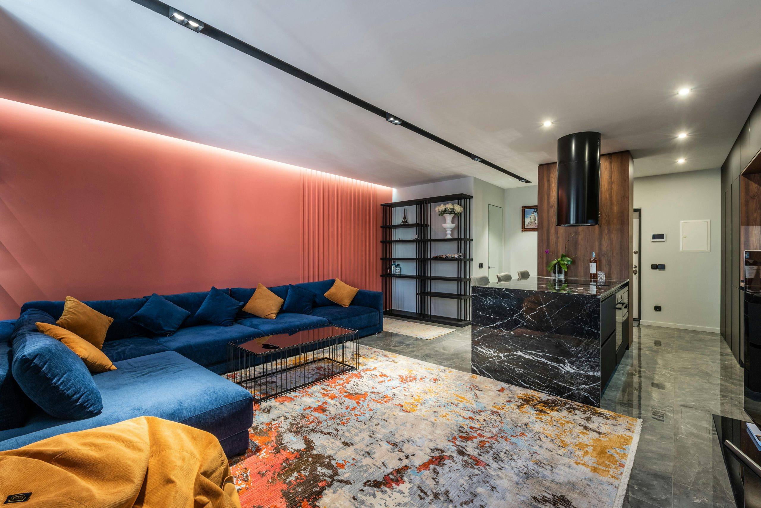
Best rooms: Playrooms, dining areas, family rooms
Orange is a fun, welcoming color that brings warmth and energy to any space. It’s less aggressive than red but still invigorating, making it perfect for social or high-activity areas.
Why it works:
Orange encourages enthusiasm, communication, and movement. It can also stimulate appetite and creativity, making it a popular choice for social spaces.
Go-to orange shades:
- Burnt Orange: A grounded, mature tone that feels cozy and comforting.
- Peach: Soft and youthful—perfect for casual or beachy decor.
- Rust: Earthy and vintage-inspired. Offers depth without overwhelming the senses.
Design tip:
Orange pairs well with deep blues, browns, and creamy whites. Use it sparingly in smaller rooms to avoid visual overload.
Can White Be an Accent Color?
Surprisingly, yes.
White is often used as a backdrop, but certain tones of white can actually serve as a subtle accent, especially in colorful or patterned rooms. It can create a moment of pause or a clean contrast point.
When it works:
- In colorful rooms, a crisp white accent wall helps break up the space.
- In small spaces, it adds brightness and keeps things open.
- In minimalist homes, off-white or warm whites can add depth without straying from the palette.
Best shades to consider:
- Bright White: Crisp and clean—best in rooms with lots of natural light.
- Alabaster or Cream: Warm and soft. Works well with earthy color palettes.
- Ivory: Adds a vintage or cozy feel, especially with traditional decor.
Is Black a Good Accent Wall Color?
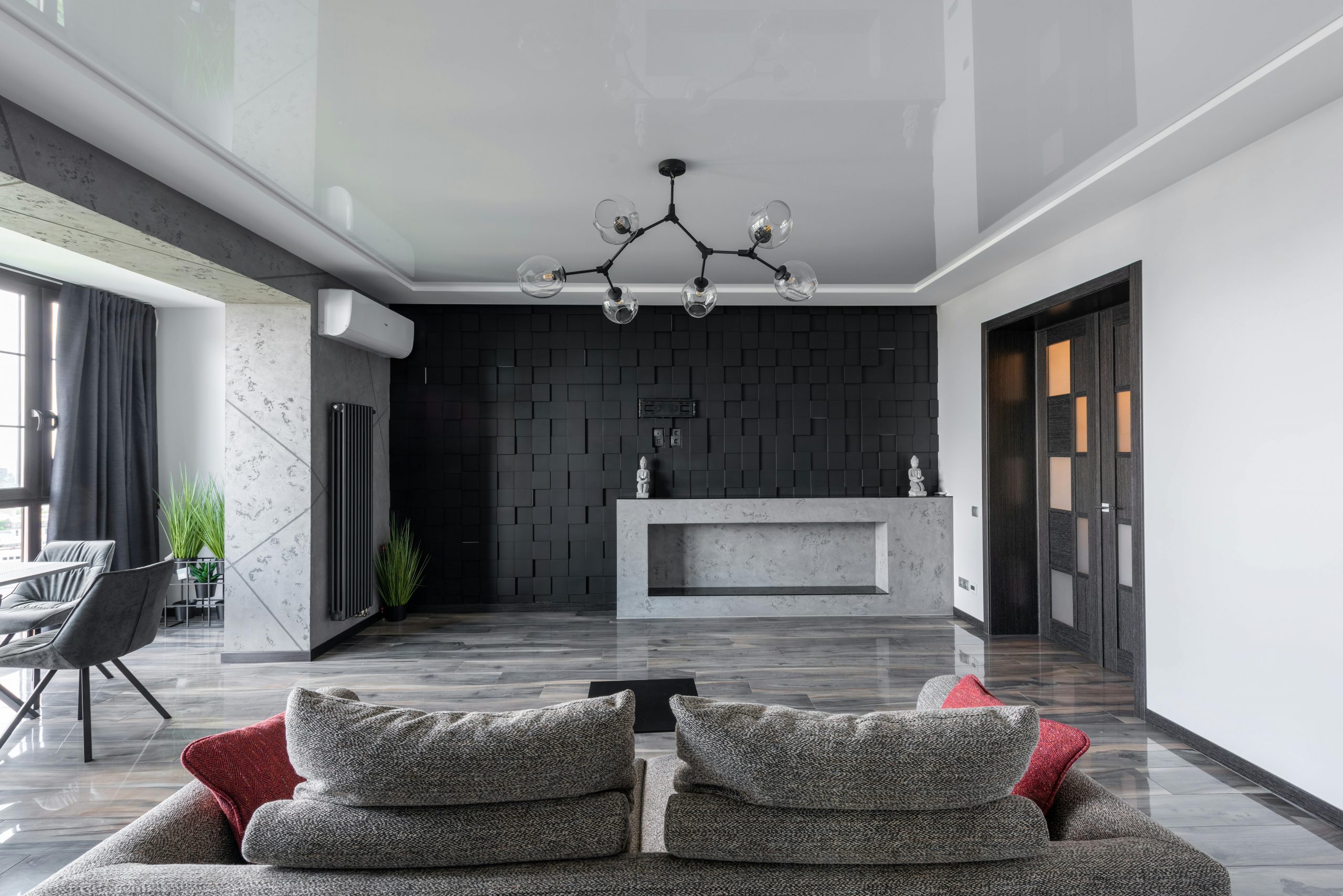
Yes! But use it with intention.
While black can seem intimidating, it’s actually a fantastic accent color—especially in modern or minimalist spaces. In color psychology, black conveys elegance, control, and depth.
Use black if you want:
- A bold, high-contrast focal point
- A gallery-style backdrop for art or decor
- A moody, cozy vibe
Best uses:
- A black accent wall behind a bed adds instant luxury.
- In living rooms, it can highlight art, shelving, or a fireplace.
- In kitchens, black pairs well with sleek cabinetry and industrial lighting.
Design tip:
Balance black with plenty of light—natural or artificial. Add pops of color or metallics to prevent the room from feeling too heavy.
How to Pair the Best Accent Wall Colors with Complementary Shades
Choosing the best accent wall color is only the first step. To make it really pop—and to tie the whole room together—you’ll want to coordinate it with complementary colors in your furniture, textiles, or other walls. It’s like building an outfit: your accent wall is the statement piece, but the rest of the colors are what make the whole look feel complete.
Here’s how to do it right, based on color psychology and simple design rules.
Blue Accent Wall Combos
Blue = calm, focused, and dependable.
To keep that tranquil vibe but add interest, pair it with:
- Soft neutrals: Beige, white, or warm gray to keep things serene.
- Warm tones: Tan leather, brass fixtures, or wood furniture to balance the coolness.
- Accent colors: Coral or mustard for a little pop without disrupting the calm.
Example: Navy blue wall + cream sofa + oak wood coffee table + brass lamp.
Green Accent Wall Combos
Green = fresh, restorative, and natural.
Play up its earthy vibe with these combos:
- Earth tones: Clay, terracotta, or tan make the space feel grounded and organic.
- Whites and off-whites: Clean, bright, and perfect for a minimalist feel.
- Botanical colors: Add depth with deep leafy greens or floral accent pieces.
Example: Sage green wall + ivory rug + rattan chair + blush throw pillow.
Red Accent Wall Combos
Red = bold, passionate, and energizing.
To keep it stylish instead of overwhelming:
- Neutrals: Gray, black, or white to create a modern look.
- Warm metallics: Copper, gold, or bronze bring out its richness.
- Contrasting cools: Use navy or forest green for high-impact drama.
Example: Brick red wall + charcoal couch + gold-framed art + cream curtains.
Yellow Accent Wall Combos
Yellow = cheerful, creative, and energizing.
Here’s how to keep the vibe sunny, not overpowering:
- Crisp whites: Bright and fresh, ideal for modern or farmhouse styles.
- Cool grays: They balance yellow’s warmth and keep the space grounded.
- Soft blues or greens: Great for a vintage or coastal look.
Example: Mustard yellow wall + white cabinetry + gray backsplash + green dishware.
Purple Accent Wall Combos
Purple = creative, elegant, and soothing.
Whether you go bold or soft, these pairings work beautifully:
- Metallic accents: Gold and silver amplify purple’s luxe feel.
- Blush pinks or deep blues: Romantic or moody depending on your goal.
- Neutral backdrops: Taupe, soft gray, or white keep it from feeling too heavy.
Example: Plum wall + taupe bedding + gold-framed mirror + soft lavender throw.
Orange Accent Wall Combos
Orange = social, warm, and energizing.
For a space that feels inviting without being too loud:
- Natural tones: Browns, creams, and terracotta play into the earthy vibe.
- Cool contrast: Teal, denim blue, or charcoal gray offer balance.
- Textured elements: Woven baskets, rustic wood, and linen add depth.
Example: Burnt orange wall + light gray sectional + wood coffee table + navy pillow accents.
Black Accent Wall Combos
Black = bold, grounding, and sophisticated.
Black can anchor a room like nothing else. Here’s how to soften or elevate it:
- White or cream accents: Creates a striking but timeless contrast.
- Bold colors: Emerald, gold, or blush pink for added flair.
- Natural wood: Keeps things warm and grounded.
Example: Matte black wall + white bedding + walnut nightstand + brass sconces.
White Accent Wall Combos
White = clean, open, and versatile.
Even white can act as an accent when paired intentionally:
- Rich tones: Navy, emerald, or charcoal offer high contrast.
- Textural elements: Wood, brick, or linen add warmth and interest.
- Subtle pastels: Light peach, pale blue, or sage green create a soft palette.
Example: Alabaster white wall + olive green accents + natural wood bench + tan linen curtains.
Quick Tips for Combining Colors Like a Pro
If you’re nervous about mixing and matching, keep these easy rules in mind:
The 60-30-10 Rule:
Use 60% of a dominant neutral (like off-white or beige), 30% of your accent color, and 10% of a contrasting color for pop.
Stick to a warm or cool palette:
Warm colors (like red, orange, yellow) work best together. Same goes for cool colors (blue, green, purple). Mixing both is possible—but needs balance.
Use color wheels for guidance:
Complementary colors (opposites on the wheel) create contrast, while analogous colors (next to each other) create harmony.
Test paint swatches in natural light:
Colors shift depending on lighting. Always check how they look at different times of the day.
Final Thoughts: Let Color Work for You
An accent wall is more than just a splash of color—it’s a way to shape the emotional tone of your space. When you choose your paint based on how you want to feel, you’re not just decorating—you’re designing a better life experience at home.
So before you grab the roller, ask yourself:
- What mood do I want this space to have?
- What’s the main purpose of this room?
- Which colors naturally make me feel the way I want to feel?
Answer those questions, and you’ll be well on your way to choosing the best accent wall color that fits your space—and your state of mind.